With the holidays quickly approaching, it’s time to think about sending out a holiday card. Everyone loves to receive holiday cards, right? Well… unless they are the Grinch they generally do.
Ask yourself, what can make my holiday card really stand out this year?
Where do I start?
You want your holiday card to stand out like Ralphie in a bunny suit from “A Christmas Story,” and style is a great place to start. Is your card for a business, a family card or maybe just for fun? It all starts with what you want your card to “say” when people look at it. If it’s for a business, it could have a nice and clean holiday design keeping it very simple but elegant. A family card may have one main image showing off your family or a few smaller images of events that happened throughout the year. Maybe it’s just an image of your dog talking about all of the fun stuff that he did throughout the year, like when he chased the neighbor’s cat up a tree or rode in the car with his head sticking out the window. Whatever the card is for, the style will determine the mood of your card.

What else should I consider?
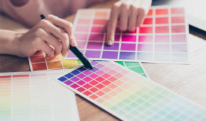
Color. There are so many options on how to add some color to your card. You can print in CMYK (Cyan, Magenta, Yellow or Black, also known as a four-color process), in PMS (Pantone Matching System), or both. Metallics can be added to make your holiday card shimmer and give it a wintery feel. If you are working with a smaller budget, there are also many great options for colored paper: rustic deep reds; shiny metallic gold or silver; and more modern shades like bright red, green, and blue can really make your card stand out.
How does your card feel?
Happy, sad, angry or does it just need some coffee? I’m not just talking about the mood of your card though; I’m talking about the texture. The way a paper feels is known as the paper finish. Paper comes in a wide array of finishes, anywhere from a coated gloss to vellum. You can also add texture by embossing or letterpress. Do you want your card to feel soft like a warm and fuzzy winter blanket or have paper fibers giving it a very natural feel? How your card feels can make an impact right when it’s taken out of the envelope, and it can say a lot with very little copy.

How does your card make a great first impression?
The envelope is the first thing that people see and often the most overlooked element when designing a card. One way to make it stand out is color. Envelopes come in all sorts of different colors, and just the right one can really make your card stand out. They also come in many different sizes, and choosing the right size is the key to making a great first impression. If it’s for a business, maybe it’s in a #10 business envelope, or perhaps maybe it’s just for fun and it’s a square. Whatever you choose, keep in mind what you want from your card and how best to make a lasting impression.

Not sure where to begin?
Ask the MarketMatch experts!