Assured Consistency with Creative Flexibility
There are two dangerous “creative personalities” that banks and credit unions often fall into:
There’s the multiple personality: Every piece of creative looks like it’s coming from a completely different place. Everything is variable from piece-to-piece: colors, fonts, tone, voice, image style. It’s like the institution’s designers are a baseball team’s five-man rotation. Each with their own ideas of success, but completely different than the one before.
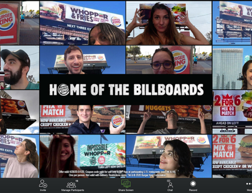
Sometimes, particularly with smaller community banks and credit unions, they literally have a creative split personality. That’s when an institution takes advantage of all the “free” marketing from their third-party vendors. You know, all that creative that’s created to promote THEIR product with no regard for YOUR brand. You can tell the “free” creative folks when their rewards checking campaign looks totally different than their insurance, which looks completely distinct from their online banking … and all of it looks lifeless.
There’s the cookie-cutter personality: For the sake of consistency, everything looks exactly the same. Digital ads look like newspaper ads that look like billboards. Everything: headline treatment, images, design structure … it all looks identical. Unless you read the copy close, sometimes it’s hard to tell a checking ad from an auto loan ad. While this trap is better than having a “split personality,” it tends to get stale very quickly.
Any designer will tell you that one of the biggest challenges is to keep brand consistency without making everything look “cookie-cutter.”
 Consistency is not a Four-Letter Word
You should always start and end your creative with your Brand Standards Manual. A proper BSM will outline:
- Your brand story
- Mission, Vision, Core Values, Brand Promise
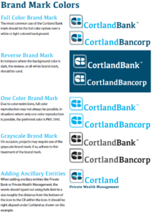
- A detailed description of your logo
- Examples of how the logo can be used (1-color, full-color, icon, no icon, reverse type, etc.)
- Logo clearances and other rules
- Improper logo uses
- Brand colors (Primary and secondary)
- Typography
- Image styles
- Messaging tone
- Sample layouts
When people see your messages, they should be able to tell it from the competition and, most importantly, know it’s you! Strict adherence to your Brand Standards Manual will have you speaking in one voice with one tone that fits your uniquely defined brand.
 Consistency Does Not Mean Rigidity
Another name for your Brand standards Manual is your “Brand Bible.” You are NOT to deviate from the standards … ever!
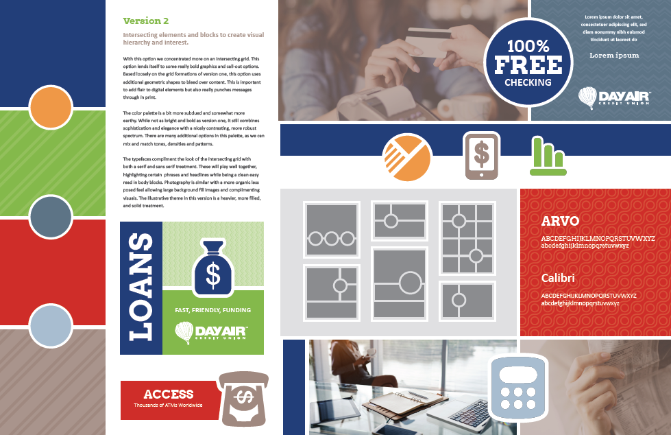
But good creative demands flexibility. To achieve both brand consistency and flexibility, it helps to create a creative Mood Board.
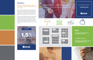
A good mood board shows your Brand Standards Manual in action. It still defines the color palette and font, but it does so much more.
Your mood board sets the tone. It shows a variety of templates that are acceptable in print or email. It provides examples of digital uses. It defines accent colors that may enhance what is outlined in your BSM. In short, it provides the creative variations that allow designers to maintain a uniform look while mixing it up a bit.
An early lesson in my advertising career was to give your creative team the, “Freedom of a Tight Strategy.” It also helps if they have well-defined boundaries. A child in a playground can be as imaginative as they want, as long as they stay in the playground’s fence. Using a Brand Standards Manual and mood boards is the same as building a playground fence for your creative team. Now … let them play!
Love this financial marketing blog?
Get the book! Click here to download “Aha Moments,” our
FREE ebook, chock-full of 80 short articles just like this.
In addition to being a strategic consultant for community banks and credit unions, MarketMatch also has nationally and internationally requested speakers. Contact us to bring our marketing ideas to your institution or next conference.
email me directly (click)
937-371-2461
Follow us on Twitter @MarketMatch