Did you know that a human’s attention span is now less than that of a goldfish?
“Oh look, a treasure chest.”
I don’t know how they did it, but some smart researchers in 2012 measured a goldfish’s attention span … “Oh look, a treasure chest” … at 9-seconds, and humans came in at only 8-seconds … “Oh look, a treasure chest.”
As a marketer, that should scare the crap out of you! You have EIGHT SECONDS to tell your story … GO!!!
Luckily, there have been tons of OTHER smart researchers that have been studying how we look at things. Here are five pointers for the next time you’re trying to tell your story.
1) “F” It!
Many studies show that, when reading, our eyes browse in an f-shaped pattern. Without an image to distract us, we will spend more time focused on the left side of the layout, across the top and near the middle.
If your message is reliant on copy, like an email, get to the point. Readers focus on the headline and initial copy. After that, you’re likely to lose them.
As you’re designing, consider putting the “important stuff” down the left-hand side.
2) Weight Watchers
Visual objects with more “weight,” or size, will draw the eye first.
Design is much more than making the page look “pretty” and balanced. Take a look a your layout and see what image dominates the page.
Then, make sure people look at what you want them to see first.
- If it is digital, is the weighted object “clickable?”
- Does the object distract from your offer or call to action?
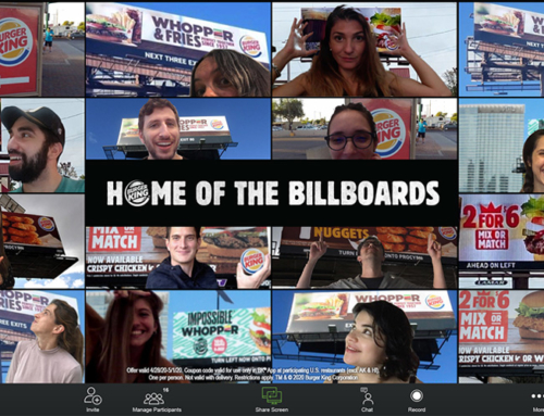
3) Your Model is a Directional Cue
We love to look at people. Studies show that, if you use a person in your design, the eye will naturally go to them first. Here’s the trick … what that model is looking at determines the reader’s next move.
Have your model looking where you want the reader’s eyes to go and the reader will follow their gaze …. they can’t help it. Have them look towards the main message, or offer. Or have them look to the call to action.
Often, we think the model should look at the camera. But, when we do this, we lose control over the reader’s eye tracking.
4) Infographics Help
65% of us are visual learners and 40% of people respond better to visual information than text alone. If you have a complex story to tell, consider how you can tell it visually. Even if an infographic can remove a paragraph or two of copy, you’ll be ahead in the “8-second game.”
5) Movement Matters
On web pages with video, we are drawn to the movement.
Whether it’s in a search or on a page, be aware that any videos you have running will draw attention to the eye – no matter where on the page it is.
DIY
There are several companies that can do eye-tracking analysis, or heat mapping for you, and for your website, that might not be a bad idea. But you can easily do your own, free, analysis.
You are too close to your own creative. Ask someone who has nothing to do with the ad or page what they see first. Give them 8 seconds to see the piece, then pull it away and ask them what they got from it:
- What was the message?
- What image do they remember?
- How did it make them feel?
With these tips, you’ll have a better chance of getting your message across in 8 seconds or less, whether you are marketing to a person or a goldfish. “Oh look, a treasure chest.”
In addition to being a strategic consultant for community banks and credit unions, MarketMatch also has nationally and internationally requested speakers. Contact us to bring our marketing ideas to your institution or next conference.
See our story here. (click)
Or email me directly (click)
937-371-2461
Follow us on Twitter @MarketMatch