Chase Bank is making inroads into many markets across the country, one of them being the Minneapolis-St. Paul metropolitan area. While this wouldn’t spark much excitement from me on any other day, after I found out a former colleague of mine has relocated to the area to manage the first branch, I decided to pay her a visit.
With that, last week I stopped into Chase’s first branch in the MSP area, which happens to be located on the University of Minnesota campus where my wife works. Expecting to walk into a quiet and empty new branch, able to see my former colleague right away, I was surprised to find a very busy branch bustling with activity. So, I had to take a seat and wait a little while for the branch manager to be available to see me.
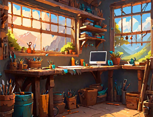
While I was sitting in the lounge – on a very nice sofa, I might add – I started observing the design, décor and overall layout of the branch. Chase, like other large bank brands, has started implementing a new café style branch layout. Complete with table booths and free WiFi, people – customers or not – are able to stop in and get work done, or, in this case, study, without being pressured into having to perform a transaction or meet with a banker.
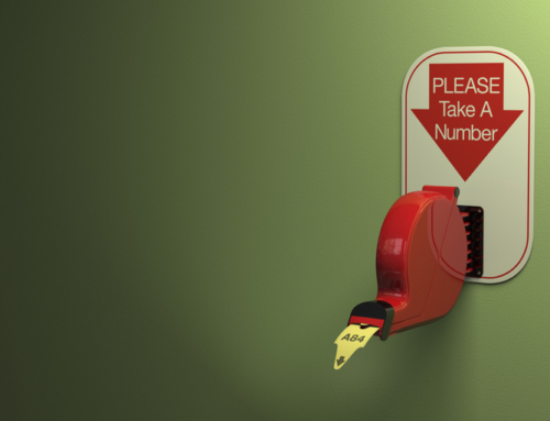
The most interesting part of my observations, however, was how Chase presents the teller line in their new branches. I watched customers come and tell the greeter what they needed. If they needed to run a transaction at the teller line, they would be directed to the back part of the branch.
Only, until a customer needed a teller, the teller window is not visible. Chase has installed opaque screens in front of each teller line station (in this branch’s case, two stations) that retract to reveal the entire teller station. When the transaction is complete, the screen goes back down, hiding the teller line completely. In fact, the screens are color-coordinated to look as if it is part of the wall.
Before seeing my former colleague, I assumed these screens were a means of security for the teller line, given the urban location of the branch. But after talking with the branch manager, I found out that security is not their primary purpose. The screens are there to lean more into the idea that the branch is a comfortable, easy-going place where customers can meet with bankers casually or just hang out with friends in the “café” section.
Essentially, the screens hide the “business” side of the branch unless it’s needed.
Whether you think this is a good idea or not, I think Chase is onto something here. It’s a known fact that brick and mortar branches are being used less and less by consumers as transaction hubs. We can deposit checks, transfer funds, check our balance and more all from our smartphones. We don’t need a branch for those things anymore.
What consumers DO need branches for are to resolve issues with accounts, find out about a new financial solution, or get counseled on their financial situation. If you have a solution to make the branch more inviting and hide the uncomfortable business end of the branch, why wouldn’t you employ it?
What are your thoughts on this style of branch design? Would this pass in your market? Let us know!